That Ruth Institute report on homosexuality and clerical abuse
Note: This is a piece by Nathan Cornwall. It was published originally at YArespond. It has been shared here with the author’s permission.
Summary:
Catholic University of America sociology professor Father Paul Sullins published a “report” with the Ruth Institute, linking homosexuality and clergy abuse.
In a footnote, he hides the fact that his data excludes the vast majority of allegations.
To make some of his conclusions, he draws on unrelated data sets which, if one digs into them, do not support his findings.
Some of his tables use aggregated data, and some do not, a fact that is hidden deep in the lengthy report.
He introduces arbitrary definitions that may introduce bias into his models.
He fails to use standard research practices, such as explaining transformations applied to his variables, expecting the reviewer to blindly trust his transformation of the data.
1. Statistics, Clergy Abuse, and Homosexuality: The Sullins Report
A study about the clergy sex abuse crises has been making the rounds in Catholic circles in the past few months, gaining attention from such organizations as The National Catholic Register, Catholic News Agency, and even the Wall Street Journal. Published by the Ruth Institute and authored by D. Paul Sullins, a former Sociology Professor at the Catholic University of America, the paper investigates a potential cause of the crises that was dismissed by the John Jay reports but which many Catholics still wish to explore: homosexuality in seminaries and the priesthood. The paper’s title states its primary question: “Is Catholic clergy sex abuse related to homosexual priests?”
Before going any further, I should pause to say a few things. This is obviously a hot-button issue. Many readers hold strong opinions one way or the other on this question. But regardless, Catholics have a duty to take into account empirical research as we together work for justice and healing in our Church and the world. As St. John Paul II famously wrote, “Faith and reason are like two wings on which the human spirit rises to the contemplation of truth” (Fides et Ratio). Science can never contradict Dogma; truth can never contradict truth. Catholics not only can but must turn to the methods of science to answer some of the questions we need to ask in order to move forward on this issue.
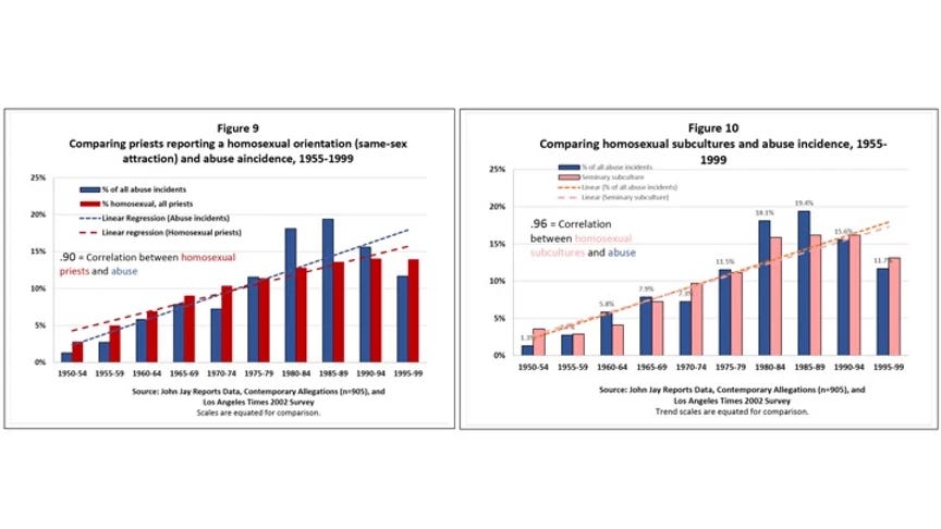
Thus, we should approach Sullins’ study with intellectual humility, seeking to learn what we can from it. As an actuary and therefore someone who works with statistics every day at my job, I would like to utilize statistical analysis to walk through questions I have about Sullins’ headline claims. They are summarized in his Figures 9 and 10.
Sullins’ Claims
Sullins presents two conclusions at the top of both the paper and his executive summary:
a .9 correlation between the number of homosexual priests and the incidence of abuse and
a .96 correlation between the prevalence of homosexual subcultures in seminaries and the incidence of abuse.
These are very high numbers, and if they can be substantiated, might point to a major link between homosexuality and abuse. Thus, we should take a closer look at the graphs and his explanations of them to make sure we know what Sullins is claiming in relation to what the data tells us.
The blue bars in both figures are the percent of abuse incidents occurring in each five-year period of time. Note that all of the blue bars (approximately) add up to 100, with the percentage for each bar calculated from the total number of cases that occurred from 1950 to 2000. This data is drawn from three sources: the John Jay reports, the Pennsylvania Grand Jury report published this Summer, and the yearly reports published by the Center for Applied Research in the Apostolate.
The red bars in Figure 9 are the proportion of priests reporting as homosexual, drawn from to a fourth source (a survey conducted by the LA Times in 2002). In the LA Times survey, a modified Kinsey scale was used to determine the sexual orientation of priests. The numbers in those red bars are aggregated by year of ordination; each bar represents the cumulative percentage of priests reporting as homosexual in the ordination classes in the five-year period. Thus, the first red bar represents the total percentage of priests who were in ordination classes in 1950-1954 and were identified by the study as homosexual.
The pink bars in Figure 10 are the proportion of priests reporting a homosexual subculture at their seminary, which is another data point collected by the same LA Times survey. These data are also aggregated by year of ordination.
The dotted lines in each graph are the trend lines of each variable, added to illustrate the close relationship between them.
The Model, and Problem #1
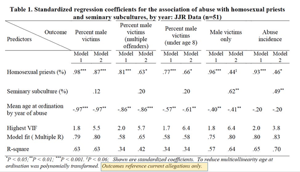
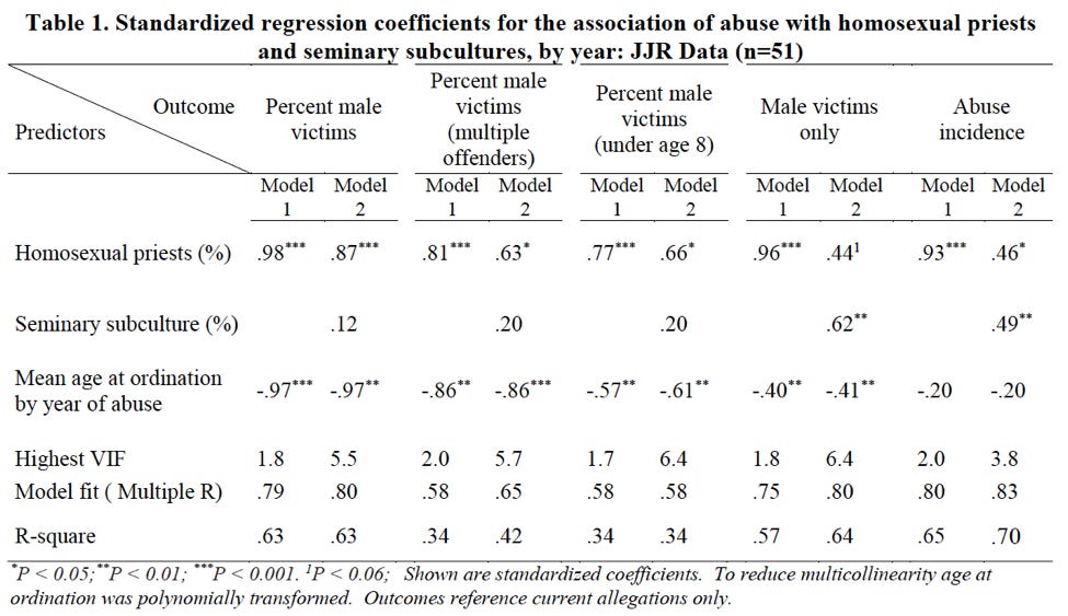
Sullins also builds several models to support his findings in Figures 9 and 10. They are summarized in the following table:
The first thing that one ought to notice here is the note at the very bottom of Table 1: “Outcomes reference current allegations only.” Sullins defines “current allegations” as those which “report abuse occurring in the same year as the allegation.” This means that the data utilized by Sullins excludes the vast majority of allegations. For example, the John Jay Report outlines a spike in reporting of abuse incidents in 2002 after the Boston Globe reporting, though the average reporting delay for those was 30 years. Model 1 would include only those incidents which were both reported in 2002 and also occured in 2002. If the incident were reported in 2002 but occurred in 2001, it would be excluded. Table 1 thus represents a very small minority of allegations.
Further, it appears that Figures 9 and 10 do not use the same data as Table 1. Note that the blue bars in Figures 9 and 10 indicate “all abuse incidents.” This means his models are built on a different dataset than the one used to calculate the correlation. Thus his models, from a perspective of statistics, do nothing to support the correlation finding.
This does not mean, however, that nothing can be gained from Sullins’ paper. Rather, it means that his data will need much more exploration in order to truly understand its significance. It also means that much reporting on his paper mischaracterizes the data and what can be gained from it.
Subsequent sections will discuss other limitations related to Sullins’ paper, in the hopes of equipping readings to better evaluate data put before them. We hope that Catholics can use what they gain in these posts to more critically review the ways in which statistics are utilized to make claims. In addressing the clergy abuse crises, Catholics need the best that faith and reason have to offer, and we hope to help equip Catholics in this offering.
2. Correlation and Aggregation
The previous section gave a brief outline of Dr. Paul Sullins’ recent paper on homosexuality and clergy abuse, discussing an initial concern related to his use of data. This section will continue this discussion, outlining some basic issues of correlation. We hope to help equip Catholics to better evaluate data presented on this very controversial issue. We have linked within this section to definitions of various terms, and we highly recommend you reviewing these, as Catholics only stand to gain from an understanding of how statistics can be used and misused to support positions.
Correlation, the statistical measure underlying Sullins’ claims, is a measure of how often one variable moves in the same direction as another. Two variables are highly correlated when, as one of them grows or shrinks, so does the other. Correlation does not take into account the scale or units of the two variables, and for this reason it should be interpreted with some caution. In one famous example of spurious correlation, an economics professor calculated a 99% correlation between the S&P 500 and the price of butter in Bangladesh. There is even a website devoted to collecting amusing examples of the phenomenon.
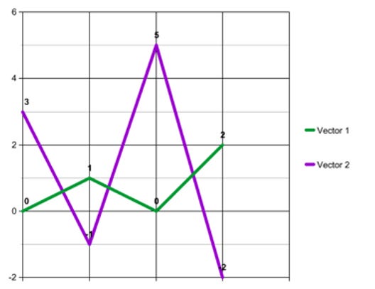
Furthermore, correlation can be very sensitive to the level of aggregation of the two variables. Take, for example, the two vectors (0, 1, 0, 2) and (3, -1, 5, -2). It is easy to see that they are negatively correlated. When the first vector goes up from 0 to 1, then the second vector goes down from 3 to -1. When the first vector goes down from 1 to zero then the second vector goes up from -1 to 5, and so on. These two vectors have a correlation coefficient of -.92, representing an extremely strong negative correlation.
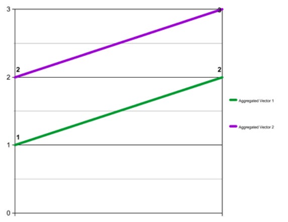
However, when the two vectors are aggregated into buckets of two values each--the first aggregated vector being ([0 + 1 =] 1, [0 + 2 =] 2), and the second being ([3 + -1 =] 2, [5 - -2 =] 3), yielding the vectors (1, 2) and (2, 3)--they have a correlation coefficient of 1, a perfect positive correlation.
This is important because the data presented in Figures 9 and 10 has been aggregated into five-year periods. His charts therefore leave open the question of whether or not the relationship between the variables in each one is as strong, in the same direction, or even still present at all if the data is disaggregated.
Sullins does admit this last point, though only deep in the paper and not in the materials edited for broader release.
Finally, there is a further problem, in that Table 1 (which, again, Sullins uses to support his correlations in Figures 9 and 10) does not aggregate the data. Rather, Table 1 appears to consider each year individually. Sullins does not explain or note this difference. Nonetheless, in our next post we will consider some of the data in Table 1 on its own.
3. Polynomial Transformation
The first section in this piece gave a brief outline of Dr. Paul Sullins’ recent paper on homosexuality and clergy abuse, discussing an initial concern related to his use of data. The second section discussed correlation and the aggregation of data. This section will continue this discussion, outlining some basic issues of polynomial transformation. We hope to help equip Catholics to better evaluate data presented on this very controversial issue. We have linked within the article to definitions of various terms, and we highly recommend you reviewing these, as Catholics only stand to gain from an understanding of how statistics can be used and misused to support positions.
In order to support the hypothesis that abuse is related to homosexuality in the priesthood and homosexual subcultures in seminary, Sullins builds a multiple linear regression model to further quantify the relationships in Table 1. Although he does not take the simple step of examining the correlations between the variables on a disaggregated basis, testing the hypothesis via a model is a good next step. The model, or rather models, are summarized in the following table:
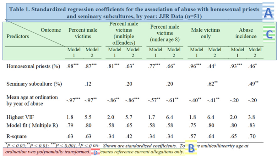
The table can be broken into a few areas of interest for now. Let’s start with the title (A below): from it, we can gain some important background on the data used for this particular model. It announces that the data used is from the John Jay reports. In addition, from the “n=51” at the end we can infer that this model was fit on yearly, rather than five-year-bucketed data, as noted previously. (This makes it even more odd that the correlations in the yearly data was not reported in the paper, as we know now that Sullins examined the data in this format.)
Finally, if we skip down to the last sentence of the footnote (B above), we see that the data on which the model was fit was restricted to “current allegations.” Again, this is a definition Sullins uses elsewhere in the paper; it means allegations that were raised in the same year as the abuse. Sullins thus excludes the vast majority of allegations from his models and most-cited figures. Discerning readers should be concerned that this may be an arbitrary definition that threatens to introduce bias into the model.
Moving down the table, the headers show the outcome variable in each model (C). For each outcome variable, two models were fit. “Model 1” includes the percent of homosexual priests. “Model 2” includes both that variable and the percent of priests reporting a homosexual subculture at their seminary. To both of these models Sullins added the mean age at ordination by year of abuse, which, skipping down again to the footnote, we find was “polynomially transformed” in order to “reduce multicollinearity” (D).
Multicollinearity1 is a technical pitfall of the class of models to which multiple linear regression belong. It occurs when two or more predictor variables are highly correlated with each other, and it causes the estimates of the model coefficients to be unreliable. This explains why Sullins would want to avoid it, but not why he included this variable in the model in the first place. It appears nowhere else in the paper and has nothing to do with the hypotheses he is testing with these models.
Furthermore, Sullins does not explain the transformation applied to the variable, which is highly irregular. As standard practice, research papers typically explain both the data used and the model form in full. Unlike most professional papers, this paper omits all such explanations and expects the reviewer to blindly trust this transformation of the data.
4. Coefficients
In the previous three sections, we gave an outline of Paul Sullins’ recent paper on homosexuality and clergy abuse. The first section ave a basic overview and discussed issues related to the data selected. The second section discussed correlation and the aggregation of data. The third section discussed polynomial transformation. This fourth and final post will discuss standardized coefficients and summary statistics.
Standardized Coefficients in Table 1
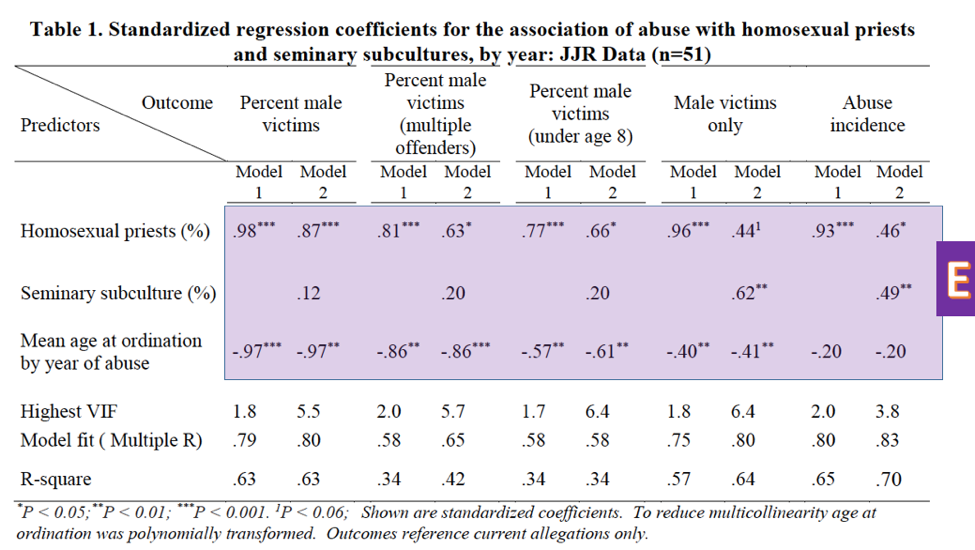
As mentioned in the previous post, the numbers in the first three rows of Table 1 in Sullins’ paper (E) are the standardized coefficients fit by the model. Standardized coefficients are analogous to the correlation coefficient explained above; they range from -1 to 1, respectively indicating perfect negative and perfect positive correlation.
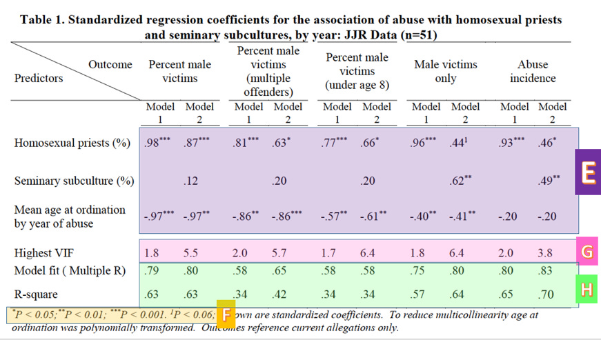
The superscripts after the coefficients (*, **, ***) indicate the level of significance, measured by p-value2. The levels can be found in the footnote (F). (P-value is a measure of the probability that the association between the predictors and the outcome variable quantified by the coefficients arose by chance; i.e. the probability that there is, in reality, no association at all.) The coefficients that don’t have a superscript following them are not statistically significant; that is, the probability that they arose by chance is too high for us to trust them. For example, because the percent of priests reporting a homosexual subculture lacks one of the symbols indicating significance in its the first three columns, we cannot conclude that its coefficient is different from zero. That is, we cannot truly determine correlation in that instance.
A final note about these coefficients: Sullins does not go in depth into what models he used or why he chose these particular ones to test his hypotheses. We should be curious why, for example, the coefficients for the models predicting percent male victims and abuse of males only are so different. Furthermore, as can be seen clearly from the table, the chosen predictors are often insignificant; in fact, the best predictor of percent male victims among the victims of multiple offenders is the (polynomially transformed) age at ordination variable. Finally, he provides no test of a null or alternative hypothesis, another item that is standard practice in research papers.
Summary Statistics in Table 1
Finally, the last three rows (Highest VIF, Model fit, R-square) are summary statistics concerning the quality of the model. VIF stands for variance inflation factor3, which is a measure of our old friend multicollinearity (G). Sullins neglects to mention, however, that VIFs over 4 are generally taken to mean that some variables in the model may be collinear, which is the case for all but one of the models involving both variables under investigation. This means that the coefficients in these models cannot be trusted. We thus cannot trust any of Sullins’ model 2 coefficients, except for “Abuse incidents” which, according to the (high) 3.8 VIF, we should approach with skepticism. Because of these high VIF’s, these variables have a high chance of multicollinearity. (Roughly speaking, when multicollinearity is present, a model is more likely to calculate a p-value for a coefficient that is lower than what it should be. As a result we are more likely to conclude that a coefficient is different from 0 when in reality it may not be.)
Sullins also includes the R-square4 for each model in Table 1. Multiple R and R-square are measures of model fit (H). Multiple R may be thought of as the correlation between the value predicted by the model and the actual value of the response variable for each set of observations, while R-square is a measure of how much of the variance in the outcome variable is explained by the predictor variables. Not only are these values much lower than the correlations reported earlier, they are much lower than is desirable for a quality model. I would not be comfortable presenting a model at my own work with an R-square less than .85 or so. Sullins’ range from .34 to .70.
Conclusion
In conclusion, not only are there questions about Sullins’ headline claims as they are presented; there are serious questions about his support of them. In the first place, measures of correlation are vulnerable to the phenomenon of spurious correlation and are sensitive to aggregation. We therefore cannot conclude without more support that the correlations Sullins reports are not spurious, particularly when they are measured on data that has been aggregated into five-year buckets. In the second place, the models Sullins builds in order to support these claims have several issues: These include an unexplained variable, potential multicollinearity, and lower numbers in general than those reported in his headline claims. Unless these issues are addressed, we cannot conclude to have learned anything new fromthe paper, which is highly susceptible to misleading representations. We should look elsewhere for empirical guidance.
Check out this video on multicollinearity:
Check out this video for an explanation of P-values:
Here’s a video on variance inflation factor. Just to warn you, it’s a bit technical…
Check out this video on R-squared, using house sales and work performance as examples:


